
The COVID-19 pandemic has forced government and public health agencies to respond quickly to the developing crisis and communicate with the public on a much more frequent basis. More important than ever, citizens need accurate and credible information to make sense of the conflicting news they are receiving. While government agencies have been regularly updating the public, they often still struggle to connect and risk losing the public’s trust. Government agencies need to cut through the noise by ensuring that they are transparent about spending, and they need to ensure that the information they are providing is concise and impactful. Using data visualization tools that make complex information easier to understand will help elevate their crisis communications and build trust with citizens.
Communications during a crisis
Weeks into the COVID-19 crisis, government agency leaders are still struggling to communicate effectively with the public and to correct the disinformation that is circulating. Good communication helps manage the expectations and fears of citizens, making it more likely that the public will cooperate on initiatives like social distancing. But even with the best of intentions, poor communication can lead to mistrust and confusion, jeopardizing the frameworks put in place for the health and safety of the community.
For this reason, how government agencies communicate during the crisis can influence how they are perceived by the public. Once trust and credibility have been lost, it can be very difficult to regain. In order to build trust with citizens and demonstrate accountability to the public, government agencies should make a point of pairing facts and figures with empathy and understanding. Although it is difficult to provide answers in a time of uncertainty, agencies who are open and transparent in their communications will engage citizens and develop greater trust.
As COVID-19 spreads, so too has false information that creates anxiety and confusion with citizens. Government agencies need to connect people with accurate and reliable information, but to break through the noise they need to adopt faster methods of providing information and not rely alone on press releases or media conferences. Proactive government agencies are fighting disinformation by sharing the most accurate and timely information on their websites or creating portals specifically devoted to providing COVID-19 resources and updates.
A regularly updated website is a great starting point; however, it is not enough to post a lot of information and hope citizens understand what your government agency is doing in response to COVID-19. Unless information is in a user-friendly format, you may not engage citizens in a meaningful way. Whether your agency is sharing the allocation of emergency funds in the community or the location of health assessment clinics, key messages stand a better chance of being understood when presented with visuals such as graphs, charts or maps.
Visualize your data with Questica OpenBook
Numbers from spreadsheets or a data set can be intimidating to the average person. Data visualization offers a sophisticated method of presenting data in an engaging format. In fact, studies have shown that humans respond better to visuals, processing visual information 60,000 times faster than text. Data visualization can amplify the key messages a government agency is trying to communicate for a more powerful effect on citizens than written words.
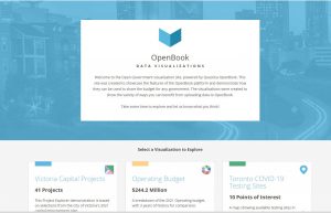
Questica OpenBook is a data visualization tool that transforms budget data and other important information into interactive visuals for increased government budget transparency. Using charts, graphs, infographics and maps, government agencies using Questica OpenBook can highlight spending decisions, projected costs, statistics and other complex information in easy to understand visuals. Questica OpenBook visualizations are also interactive, allowing citizens to search, view and drill-down through data for a deeper understanding of a government agency’s response to COVID-19.
For example, our Open City sample visualization site below shows COVID-19 testing sites in the City of Toronto:
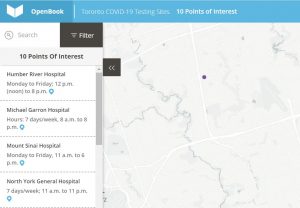
You can include supporting information such as additional details, photos, videos and website links.
Get started with Questica OpenBook
Data visualization is the tool government agencies need to increase budget transparency and build trust at a time when citizens want to feel connected to their local government. While health professionals fight to save lives and researchers hurry to develop a vaccine, practicing good communication is now a crucial component of any government agency’s efforts to provide clear, easy to understand information to the public. Using Questica OpenBook can transform complex financial information into engaging visuals that help citizens understand spending decisions.